


To start our dive into motion and animation basics in presentation design, let’s explore the four main benefits of using animations in your presentations.
1.The first is to communicate your ideas effectively; by adding animations, you can illustrate complex ideas clearly and effectively, making the message you’re trying to communicate easier for your audience to understand and remember.
2. Animations also help your presentation stand out, as it shows that you’re able to hone more of the presentation design process, ensuring that your presentations are more engaging and visually appealing, setting them apart from generic slide designs.
3. Another big benefit of animations is that they help delight your audience. Well-executed animations can capture attention and keep your audience engaged, making your presentation more enjoyable and memorable. Personally, I’m a sucker for nice motion and interactions—just a bunch of little things that are done really well that lead to a great experience.
4. Lastly, it helps push design forward as it demonstrates a commitment to modern, cutting-edge design practices, showing that you can move away from the "standard design practices" and explore creative ways to deliver a more engaging experience.
Now, when we talk about animation within the context of presentation design, there are three main types: functional animation, structural animation, and emotional animation.
1. Functional animation enhances the usability and understanding of the presentation by providing feedback and guiding the audience's attention. Think like slide transitions, progress indicators, interactive buttons, and hover effects.
2. Structural animation organizes content and helps to clearly demonstrate the relationship between different elements within the presentation. This includes animations that show hierarchies, flowcharts, and step-by-step processes.
3. Emotional animation adds a layer of engagement and emotional connection with the audience. These animations create a specific mood, making the presentation more enjoyable and leaving a lasting impression. Think of them as moments of delight.
See presentation examples on the different types of animation.
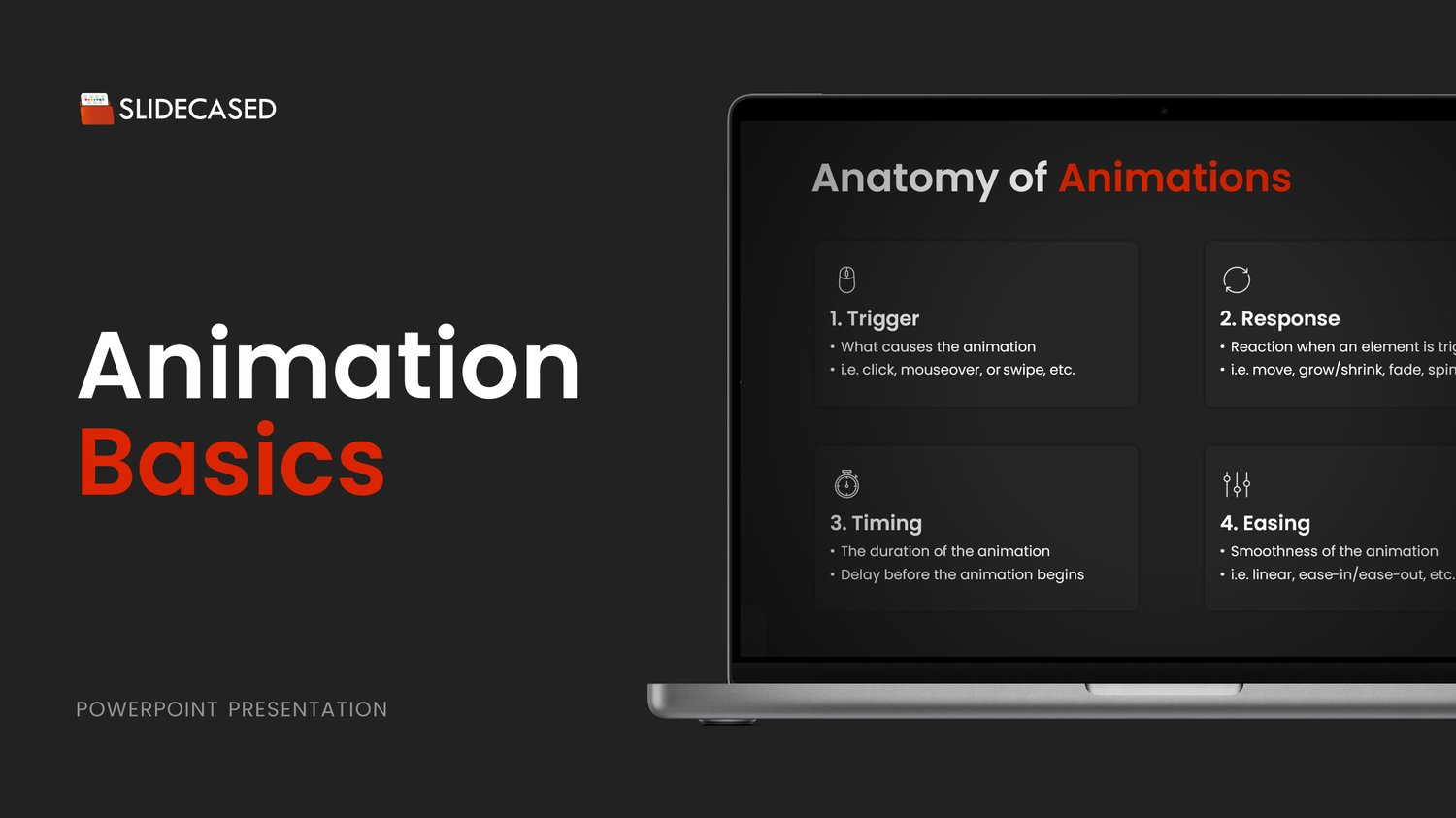
Now, let’s talk about the anatomy of an animation.
So all animations will have four main parts; they will have a trigger, a response, timing, and easing applied to them.
The trigger is what actually causes the animation. This can be an action like a click, mouseover, or swipe, and it can be set manually or automatically.
Next, we have the response, which is the animated reaction that occurs when the element is triggered. So, do they move? Do they increase or decrease in size? Do they fade? Spin? Just to name a few.
Then we have the timing of the animation, which is comprised of two parts: the duration, which is how long the animation takes, and the delay, which is how long after the trigger, the animation will begin.
Finally, we have easing, which is essentially the smoothness of animation. Easing is used to mimic real-world behavior, making animations appear more natural and less mechanical.
Now, let’s go over some guiding principles on timing durations.
When dealing with interactive elements like clicks and mouse-overs, avoid using long durations as they make the response feel slow. These interactions need to be quick, so I recommend a maximum duration of 500 ms (half a second) for this type of interaction to maintain good perceived performance. This is because timing can control the pace and engagement of your presentation.
On the other hand, longer durations are used to create drama and impact, such as in slide transitions or when objects move across a large part of the screen.
See presentation examples here.
For delays, there are two ways you can go about it: a regular delay and a staggered delay.
- A delayed animation includes a pause before the start of a single animation or an animation sequence.
- A staggered delay creates a cascading effect, with elements animated in a staggered fashion, which makes for a more dynamic and interesting experience.
See timing delay comparisons here.
Now, let’s talk a bit about easing.
Remember, easing helps influence the smoothness of the animations.
There are five main easing functions used in animating design elements:
1. Linear Easing:
- Behavior: The animation proceeds at a constant speed from start to finish.
- Use Case: Suitable for simple, straightforward movements without any need for acceleration or deceleration.
2. Ease-In (Smooth Start or Accelerate):
- Behavior: The animation starts slowly and then speeds up towards the end.
- Use Case: Ideal for introducing elements gently onto the screen, building up momentum.
3. Ease-Out (Smooth End or Decelerate):
- Behavior: The animation starts quickly and then slows down towards the end.
- Use Case: Perfect for making elements settle smoothly into their final positions, providing a sense of closure.
4. Ease-In-Out (Ease Both):
- Behavior: The animation starts slowly, speeds up in the middle, and then slows down again towards the end.
- Use Case: Great for smooth and natural transitions, giving a balanced and organic feel to the movement.
5. Elastic Easing (Bounce End):
- Behavior: The animation starts quickly, decelerates, and then bounces back before coming to a stop.
- Use Case: Effective for playful or attention-grabbing elements, adding a dynamic and lively feel to the presentation.
Understanding when to apply these easing functions is really important, as it helps mimic the behavior of the real world, making animations and interactions feel very natural and less mechanical.
See presentation examples of when you can use the different easing functions.
Now that we've covered the basics, here are ways to use animations in your presentations.
1. First is for effective visual demonstration, basically animated infographics. In this case, you’re using animation to introduce different activities or steps in a process, ensuring you communicate your ideas in both an appealing and engaging way.
2. You can also use animations to enhance your data visualization, moving away from static visuals and bringing your data to life with subtle motions and effects.
3. Another way to incorporate animation is through micro-interactions, like clicks and mouse-overs. You can see some examples here; the creative possibilities are unimaginable, and overall, it ensures a more immersive experience for your audience.
4. Finally, animations can be used to create engaging minimal visuals. If you’re like me and you consume motion and design content on social media, you’ve probably seen these types of animations on TikTok and Instagram, and the high engagement on these pieces of content is a clear indicator that people prefer animated content over static visuals.
That concludes today’s post. If you have any questions or feedback, feel free to reply to this post, and I’ll do my best to address them all.
Thank you for reading!
Best regards,
Hamdi
